Designing A Visitor-Centric Experience in Corporate & Brand Museums
When you visit the Louvre, you make it a point to see the Mona Lisa.
At the Van Gogh Museum in Amsterdam, people debate whether the must-see is the almond blossoms, the sunflowers, or a famous self-portrait (because Starry Night resides elsewhere; otherwise, all arguments might have been settled).
Things don’t work like that at a corporate museum, do they? That’s probably because nobody puts “See Company A’s VR factory tour” on their bucket list.
That’s why an object-centered approach isn’t exactly optimal for your brand museum. Unlike the Van Gogh Museum, which is a tribute to a great painter, your museum is less likely a tribute (though it does that, too) and more likely a component of your marketing strategy.
Even if you intend your brand museum to celebrate your brand’s legacy and achievements, your end goal is still brand equity and a sense of superiority to your peers (in other words, “pick us over the competition for your next deal”). Or at the very least, brand differentiation.
This means that your brand museum is less about what you’re showcasing and more about what you want the visitor to think and do after the experience.
That’s exactly why visitor-centered approaches are so critical in corporate and brand museum design. Museums can create immersive and captivating experiences by placing the visitor at the core, helping them achieve the marketing (or any other) goals that the brand center investment is intended to achieve.
In this blog, we look at tips, tools, and techniques for creating engaging and meaningful visitor experiences at corporate and brand museums.
Four Essential Tools for Crafting a Visitor-Centric Museum Experience
Visitor Personas
Just like buyer personas aid your sales team, visitor personas—fictional representations of target audience segments—can help you gain deeper insights into visitor experience and motivations, preferences, and behaviors. Understanding visitors’ thoughts, feelings, and perspectives enables you to plan more engaging and outcome-focused exhibits.
For instance, at the Digital Experience Zone of a leading consultancy company in India that we worked on, details of the proposal in progress with visitors are used to tailor experiences. This ensures that each visitor leaves with a positive impression, a deeper connection to the brand, and a highly contextualized experience (and also preferably a signed deal)!
Mapping the Visitor Journey
As the name suggests, a journey map is a visual representation of the visitor’s journey through the space or the chronology of exhibits they will visit.
Journey maps are an invaluable tool for the team planning a brand museum or any other kind of experience zone. For example, we once had to develop an experience zone that spanned 15,000+ square feet. Moreover, what we would eventually create would need to be incredibly impressive (and flawless) because the project was for the Indian Ministry of Petroleum and Gas, and the Prime Minister was supposed to visit, along with dignitaries from other countries.
One of the tools that helped us plan such an expansive space and a really large number of assets was mapping the whole journey —- we also had robots guiding visitors through the space to help them.
Optimizing Visitor Flow
This is the next step to your journey map and a step that you should keep coming back to even after your corporate museum is up and running. Instead of making visitors adapt to the space, brand museum designers should focus on shaping the environment to fit their needs. What would they want to see first? When would they want to be photographed exploring an installation? At what point might they want to take a bio-break? Where do you need convergence points for explanations? At what point are visitors best off branching off on their own?
More questions, such as whether your target audience will visit as a team or as independent individuals, might guide this.
It would help if you mulled over these considerations (which you might tweak to your unique context—consider this a starter kit) and planned your visitor flow, which might, in turn, cause a few modifications to your journey map.
Don’t forget to come back to this step when your museum is up and running.
Make your own notes — or rope in facilitators—to develop insights on visitor flow that can help optimize the museum’s design. If you’re relying on facilitators, don’t forget to coach them on what to watch for, like
– When do people typically opt for a break?
– When do they ask (or express willingness) to be photographed exploring assets?
– Do they suddenly want to come back to a prior asset after seeing a specific asset (this might be a hint to change the order in which they view assets if it isn’t too big a task)?
Crafting Seamless Experiences with Service Blueprints
Service blueprints map the entire visitor experience, allowing museums to identify touchpoints and design seamless interactions. By aligning internal processes and resources with visitor needs, brand museums can create cohesive and enjoyable experiences. A service blueprint helps us to ensure that all aspects of the visitor experience—especially those that rely on facilitators or behind-the-scenes tasks—work as expected.
For example, at one of the brand experience centers we worked on, we have a VR dome that allows multiple viewers to experience a VR tour of the petroleum refinery. The service blueprint for this component of the experience
- Placement of the required number of VR headsets (depending on the number of visitors) at the installation
- Ensure facilitators are on standby to offer assistance
Let’s look at some more examples of what your service blueprint would entail:
All corporate museums personalize their welcome messages or welcome walls to welcome visitors by name. In most cases, these welcome messages also include their job title and company name. A service blueprint would ensure that this step is carried out prior to visitors’ arrival.
Similarly, some corporate museums might like to tailor some of the immersive experiences to the products and solutions most relevant to the visitor’s business — a service blueprint would prompt the necessary workflows around this.
Similarly, at special installations where a photo op is standard procedure, service blueprints ensure that a facilitator is on standby, the camera is in hand, the lighting is set up, and the space is ready for visitors to pose and capture the moment effortlessly.
Optimizing For Maximum Engagement With XR
Immersive exhibits play important roles in making your visitor experience memorable and helping you make your point — or showcase your USPs, expertise, or future readiness — in vivid detail. Today’s brand museum design will always incorporate a majority of immersive exhibits.
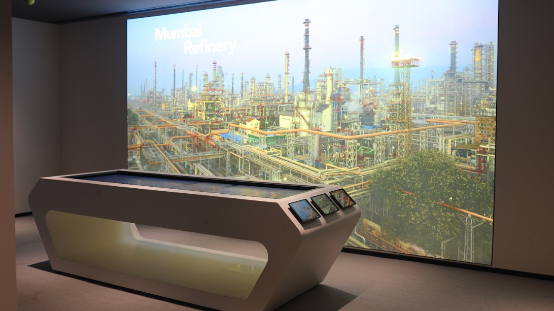
For example, we created an AR Table as part of our BPCL Brand Museum design that allows the brand to cater to different brand personas with unique interests. iPads are docked along the table, and visitors can scan the display on the table (or a life-size image of the refinery that stands beside it) to learn more about aspects of the refinery that they are most interested in.
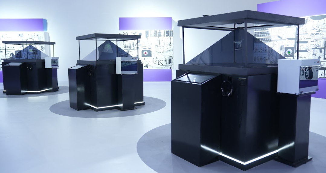
Similarly, the Holo Pyramids at the India Pavilion at India Energy Week 2023 are designed for diverse visitor groups, providing a multi-person immersive experience that allows several teams to view different content simultaneously.
Four Considerations for Visitor Experience Design
- Experiential Learning
Experiential learning is about the idea that people learn best when they can get hands-on and participate. Corporate museum designers should aim to create opportunities for visitors to really interact with the content, encouraging them to explore, try things out, and discover new information.
That’s exactly why we recommended interactive exhibits in our previous section — immersive tech keeps visitors engaged. It helps them remember what they’ve learned better (because they “discover it themselves” in a way).
- Emotional Design
Emotional design is all about making visitors feel something and having a great experience. Designers pay attention to how things look, sound, and feel to create specific emotions. The aim is to make visitors feel inspired or curious, which makes their visit more memorable and enjoyable.
We tapped into the emotional design at one of our top security consultancy clients’ corporate museum in a three-part approach.
- We designed a very futuristic-looking passageway amidst exhibits that also mentioned all the brand’s top services and solutions.
What visitors feel: “Wow! This company is really cutting edge!”
- Another section showcasing real-time threat monitoring effectively uses emotional design to evoke a sense of awe (and, alongside, a need for security).
What visitors feel: “The threat landscape is evolving and growing! We definitely need to have a robust risk-management game. This brand certainly has its eye on the threats.”
- At a third emotional trigger point (following VR content contextualized to the visitor’s business), visitors view the brand’s operational setup through an expansive window, effectively responding to the need for security with a definitive “we’ll keep you secure.”
What visitors feel: “With an operational setup like this and the solutions and threat management capabilities we’ve seen thus far, this brand seems like the right option)
- Universal Design
Universal design ensures that everyone can enjoy the experience, no matter their abilities, age, or background. In an increasingly inclusive world, designers need to consider things like easy wheelchair access, clear signs, materials in different languages, and sensory-friendly features.
Depending on your target audience’s needs, you might also want to consider multi-lingual language guides (that might be relevant when you are welcoming regional government officials).
- Spatial Design
This is an extension of our discussion about visitor flow in the previous section. Clear directions are critical for brand museums or experience zones where visitors will undertake the experience independently. Similarly, when you’re thinking spatial design (and you combine it with visitor flow), it becomes easier to decide where to place exhibits, seating areas, and other facilities to ensure that visitors are comfortable — the last thing you want is for discomfort to interfere with the message you’re trying to get across.
5 critical steps to designing a visitor-centric experience:
If your brand museum design is to center on the visitor experience, your first step is to understand your visitor. Your planning journey should look something like this:

Pro-tip: Test your experience center with a walkthrough. Find colleagues or senior stakeholders within your organization who can put themselves in the target visitor’s shoes and offer you any critical feedback and/ or pointers.
Top Questions in Visitor Experience Design for Corporate and Brand Museums
In this section, we explore the key questions that should guide your visitor experience design process to ensure brand and visitor success. Addressing these questions helps you align your museum’s goals with your visitors’ expectations, creating an engaging and meaningful museum design and experience.
- What is the goal/purpose of the brand museum for us (the brand)?
- What needs to happen for the brand museum to be considered a success (for us, the brand)?
- What needs to happen for our visitors (that is, our customers or other stakeholders) to consider their visit to the brand museum a success?
- How do we enable that success for visitors?
- Low-hanging fruit: What is a feasible idea that is a no-brainer to implement?
- Most delightful: What ideas are most likely to surprise and delight your users?
- Most breakthrough: What ideas, if implemented, are the most game-changing?
To answer question 3, you need to conduct some research. The only way to get this information right is to ask your target audience or a representative section of your target audience) in a pre-concept survey.
3 Must-Have Questions in a Pre-Concept Survey:
- “When was the last time you visited a museum? Why did you visit?” You can follow this up with a question like, “Why do you usually visit museums?” but it’s not an either/or. The first will get you the specifics you are looking for.
- “Tell me about a time (or more) when you had a really successful brand museum visit that you felt was worth your time.”
- “How much time should the ideal brand museum exercise wrap up in (from entry to exit, including handshakes, photo ops, and welcome drinks)?”
Pro-tip: Always ask why. You can use phrases such as “Tell me more,” “Why is that?” and “How come?” It’s important that you dig below any expression of opinion or belief to get deeper insights.
Ready to Drive Improved Success with Your Visitor-Centric Approach?
Creating a meaningful and engaging experience in corporate and brand museum design requires a deep understanding of your visitors and how their goals align with your brand’s objectives. At magineu, this visitor-centric approach is fairly standard. That’s how we ensure every brand museum delivers maximum impact.
Our method includes:
- Understanding Your Visitors: We begin by developing visitor personas and conducting thorough research to gain insights into their motivations, preferences, and behaviors. This foundational step ensures that every aspect of the museum is designed with the visitor in mind.
- Defining Success: Success is clearly defined by aligning the museum’s goals with the visitors’ expectations. This involves mapping out what needs to happen for the museum design to be considered a success for both the brand and the visitors.
- Ideating with Cutting-Edge Tech: We fuse innovative technology with creative storytelling to make the museum experience immersive and compelling. This includes brainstorming and conceptualizing ideas that use augmented reality, virtual reality, and other interactive installations to captivate your visitors and tell your brand’s story in the most memorable way possible.
- Prototyping and Testing: Before final implementation, we prototype and test concepts, installations, and ideas to ensure they deliver the desired outcomes. This iterative process helps refine the visitor experience to perfection.
- Outlining Facilitation: Once the design is finalized, we outline how efficient the facilitation of the experience will be. This includes helping you train your facilitators, setting up (and maintaining) interactive elements, and ensuring all components of the museum design work seamlessly together.
By adopting a visitor-centric approach, you can transform your brand museum into a powerful tool for engagement and education. This approach not only enhances brand equity but also creates memorable experiences that leave a lasting impression on your visitors.
Take the Next Step with magineu
If you’re ready to elevate your brand museum experience, magineu is here to help. Our expertise in visitor-centric design ensures that your museum not only meets but exceeds visitor expectations, making it a standout in the industry.
Talk to our team today to find out how you can develop visitor-centric experiences at your brand museum, experience center, or executive briefing space.
